What does the word ”icon” mean to you? Is it a symbol that instantly brings an idea to mind?
Or maybe a person who inspires you deeply? Icons are everywhere—in your phone, on your favorite app, and even in your daily life. They help you understand things quickly and connect with powerful messages. If you want to discover how icons shape your world and why they matter more than you think, keep reading.
This article will open your eyes to the hidden power behind these simple yet unforgettable images.
Essentials Of Icon Design
Icons are small images that help people understand and use apps, websites, and products. Good icon design makes things clear and easy to find. It needs careful thought and skill.
This section explains the basics of icon design. Learn what makes icons work well, popular styles, and how to pick the best file type.
Key Principles
Icons must be simple and clear. Too much detail confuses users. Use basic shapes and lines to create strong visuals. Keep icons consistent in style and size. Make sure they look good at any size, from small buttons to bigger displays.
Colors should match the brand and theme. Contrast helps icons stand out. Avoid too many colors to keep the design clean. Test icons on different backgrounds for visibility.
Common Styles
Flat design is popular. It uses simple colors and no shadows. This style is clean and modern. Material design adds depth with shadows and layers. It looks more 3D and realistic.
Outline icons use thin lines and no fill. They work well for minimal looks. Filled icons have solid shapes and bold colors. They are easy to see and understand.
Choosing The Right Format
Icons come in many file types. SVG is best for web use. It scales without losing quality. PNG is good for simple images but can get pixelated when resized.
Use vector formats like SVG for sharp icons on any screen. Raster formats like PNG suit fixed sizes. Choose based on where and how the icon will be used.
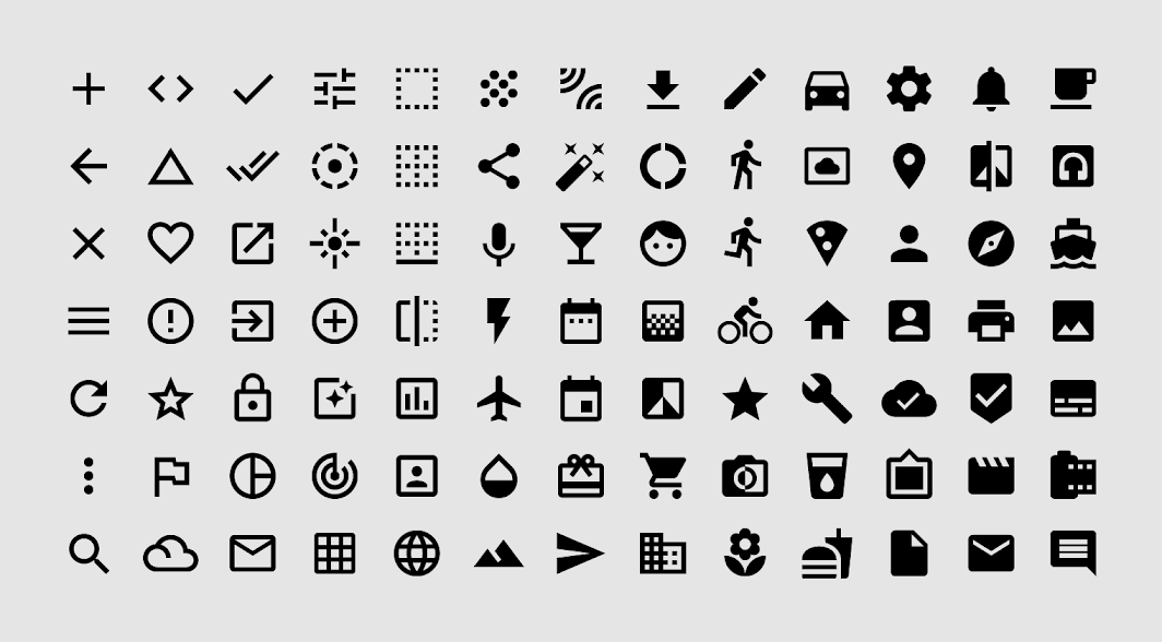
Credit: m2.material.io
Tools For Icon Creation
Creating icons requires the right tools to bring ideas to life. These tools help design clear, sharp, and attractive icons. Choosing the right software can save time and improve quality. Some tools work better for certain styles or file types. Understanding different options helps pick what fits your needs best.
Popular Software Options
Adobe Illustrator is a top choice for many icon designers. It uses vector graphics, allowing icons to scale without losing quality. Sketch is popular among Mac users for its simple interface. Figma offers easy collaboration and works in the browser. Affinity Designer is a budget-friendly alternative with strong features. Each software has unique strengths for icon creation.
Vector Vs Raster Tools
Vector tools create icons using shapes and lines. These icons stay sharp at any size. Raster tools work with pixels, which can blur if resized. Vector icons are best for logos and apps. Raster icons suit detailed images or textures. Knowing the difference guides the design process for clear results.
Plugins And Resources
Plugins add extra features to icon software. They speed up tasks like color selection or exporting. Resources like icon libraries provide ready-made graphics. Websites offer free and paid icon packs. Using these tools helps create unique icons faster. They support creativity and improve workflow.
Designing For Clarity
Designing for clarity means making icons easy to understand at a glance. Icons should communicate ideas quickly and clearly. Clear design helps users find what they need without confusion.
Good icon design balances simplicity with meaning. It removes extra details that do not add value. Clarity helps users recognize the icon’s purpose fast.
Simplifying Complex Ideas
Icons often represent big ideas in a small space. Breaking down complex ideas into basic shapes works well. Use simple symbols that everyone can recognize. Avoid using too many elements in one icon.
Focus on the main concept. Remove anything that distracts from the core message. Simple icons help users understand meaning quickly and easily.
Effective Use Of Space
Space around and inside an icon affects clarity. Proper spacing keeps the icon neat and balanced. Avoid crowding shapes or text within the icon.
Use white space to separate elements. This makes each part clear and easy to see. Balanced spacing also improves the icon’s look on different screens.
Balancing Detail And Simplicity
Too much detail can make an icon confusing. Too little detail may leave users unsure what it means. Find a middle ground with clear but simple shapes.
Add only details that help explain the icon’s meaning. Keep lines and shapes clean and bold. This balance keeps the icon useful and attractive.

Credit: stock.adobe.com
Color And Contrast
Color and contrast play a big role in how icons catch attention and communicate meaning. They help make icons clear and easy to understand. Choosing the right colors and contrast levels improves the user experience. It also helps icons fit well with the overall design.
Good use of color and contrast ensures icons stand out without being harsh or confusing. It guides the eyes and highlights important parts. Let’s explore key points on selecting colors and using contrast effectively.
Selecting Color Palettes
Pick colors that match your brand and message. Use simple palettes with two or three colors. Too many colors can make icons look messy. Choose colors that work well together and feel balanced. Soft tones can feel calm, while bright tones grab attention. Keep color choices consistent across all icons.
Ensuring Accessibility
Colors must be easy to see for everyone. Some people have trouble seeing certain colors. Test icons for color blindness and low vision. Use tools to check if colors are clear and readable. Avoid color combinations that blend together. Add shapes or outlines to help recognize icons without color.
Using Contrast To Enhance Visibility
High contrast makes icons easy to spot on any background. Dark colors on light backgrounds or light colors on dark backgrounds work best. Avoid low contrast that makes icons hard to see. Contrast also helps show icon details clearly. Strong contrast guides users and improves quick recognition.
Scalability And Responsiveness
Scalability and responsiveness are key to using icons well. Icons must look clear and sharp on all screen sizes. They should adjust smoothly without losing quality. This helps users have a good experience on phones, tablets, or large monitors.
Icons that scale properly make websites and apps feel professional. They keep the design consistent and easy to understand. Responsive icons also load fast and fit different layouts. This saves time and keeps visitors happy.
Designing For Different Sizes
Create icons with simple shapes and clear lines. Avoid too much detail that blurs when smaller. Use vector formats like SVG for smooth resizing. Test icons at small, medium, and large sizes. Make sure they remain recognizable and balanced.
Testing Across Devices
Check icons on many devices and screen resolutions. Include smartphones, tablets, laptops, and desktops. Notice any blurriness or pixelation problems. Adjust designs based on real device feedback. This ensures icons look good everywhere.
Optimizing File Sizes
Keep icon files small to improve loading speed. Compress SVG or PNG files without losing quality. Remove unnecessary code or hidden layers in vectors. Smaller files reduce data use and help pages load faster. This boosts user satisfaction and SEO.
Trends In Icon Design
Icon design changes with technology and style preferences. Designers choose styles that fit user needs and brand identity. Trends help keep designs fresh and easy to understand. Below are key trends shaping icon design today.
Minimalism And Flat Design
Minimalism uses simple shapes and few colors. It removes extra details to focus on the main idea. Flat design avoids shadows and 3D effects. Icons look clean and clear. They load fast on websites and apps. Users find these icons easy to recognize.
3d And Skeuomorphic Styles
3D icons add depth with shadows and highlights. They feel more lifelike and touchable. Skeuomorphic design copies real objects closely. It uses textures and details to look natural. These styles bring a sense of familiarity. They work well for apps that want a classic look.
Animated Icons
Animated icons move or change to attract attention. They show actions or status clearly. Animations can be simple, like a bounce or spin. They make interfaces more interactive and fun. Proper use guides users without distractions. Animated icons improve user experience effectively.
Common Pitfalls To Avoid
Icons play a key role in design. They guide users and make content easier to understand. Many designers make common mistakes that reduce icon effectiveness. Avoiding these errors helps create clear and useful icons.
Overcomplicating Designs
Simple icons work best. Too many details confuse users. Complex shapes lose meaning at small sizes. Stick to basic forms and clear lines. This keeps icons easy to recognize and fast to understand.
Ignoring Context
Icons must fit their environment. Using the wrong style or symbol causes confusion. Match icons to the message and audience. Think about where and how people see the icon. Context ensures icons feel natural and useful.
Poor Consistency
Consistency builds trust and clarity. Mixing different icon styles looks messy. Use the same size, color, and style throughout. Consistent icons help users learn and navigate faster. Keep your icon set uniform and balanced.

Credit: commons.wikimedia.org
Tips For Icon Set Creation
Creating an icon set is a careful process. Each icon must fit well with others. This helps users understand and enjoy your design. Follow these simple tips to make your icon set clear and consistent.
Maintaining Visual Harmony
Keep all icons balanced in size and shape. Use the same line thickness across the set. Choose similar colors or shades for each icon. Align icons properly so they look neat together. This creates a smooth and pleasing visual experience.
Establishing A Style Guide
Create rules for your icon style before starting. Define colors, shapes, and sizes to use. Decide on the level of detail for each icon. Write down these rules in a style guide. This helps keep your icon set consistent and easy to update.
Testing With Users
Show your icons to real users. Ask if they understand each icon’s meaning. Watch how users interact with your icons. Note any confusion or mistakes. Use this feedback to improve and simplify your icons.
Frequently Asked Questions
What Is An Icon In Design And Branding?
An icon is a simple graphic symbol representing an idea, object, or action. It enhances recognition and user experience. Icons help brands communicate quickly and clearly, making interfaces intuitive and visually appealing.
How Do Icons Improve User Interface Experience?
Icons guide users by visually representing functions or content. They reduce text clutter and speed up navigation. Well-designed icons increase usability and help users find information faster.
What Are The Types Of Icons Used In Digital Media?
Common icon types include glyph, outline, flat, and 3D icons. Each style serves different design needs and contexts. Choosing the right icon type improves clarity and aesthetic appeal.
How To Create Effective Icons For Websites?
Effective icons are simple, consistent, and scalable. Use clear shapes and avoid excessive details. Ensure icons match the website’s style and are easily recognizable.
Conclusion
Icons play a big role in how we see and use things. They help us understand quickly and make choices easy. A good icon speaks without words. It connects ideas and feelings fast. Choosing the right icon can boost your message clearly.
It stays in people’s minds longer. Remember, simple and clear icons work best. They make any design or message stronger. Keep icons easy to recognize and use. This way, your message reaches more people with less effort. Icons are small but powerful tools everyone should use well.