
Webb · Brand
Walborg Coworking
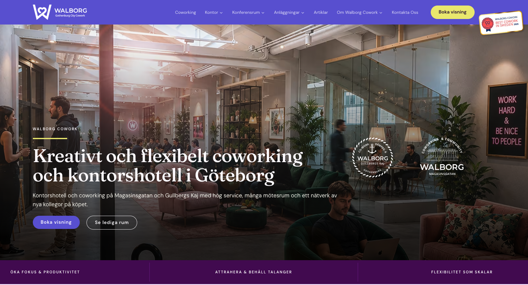
Walborg Coworking är en mötesplats för kreatörer, entreprenörer och frilansare i Göteborg. Hive Creatives byggde webbplatsen och varumärket som speglar communityt – inte bara kontorslokalerna.
About the business and the brief
Walborg Coworking erbjuder kontorsplatser, studio, eventutrymme och gemenskap för Göteborgs kreativa klass – formgivare, frilansare, småbolag och entreprenörer som söker mer än bara ett skrivbord. Uppdraget från Walborg var att bygga en webbplats och ett varumärke som speglar communityt lika mycket som lokalerna: en digital plats som både lockar nya medlemmar och ger befintliga en känsla av tillhörighet. Hive Creatives ansvarade för strategi, varumärke, webbdesign, utveckling och copy.
Challenge
Coworking-marknaden i Göteborg är mättad och många aktörer kommunicerar samma saker: "gemenskap", "flexibilitet", "centralt läge". Walborgs verkliga differentiering ligger i communityt – den specifika mixen av kreatörer och entreprenörer som faktiskt sitter där – men det är svårt att kommunicera utan att låta exkluderande eller svävande. Utmaningen var att bygga en webbplats och ett varumärke som känns inbjudande för rätt målgrupp, differentierar sig från konkurrenterna och samtidigt driver konkreta medlemsförfrågningar och visningar. Lägg till krav på bokningssystem för event, integrering med coworking-plattform och en visuell identitet som matchar en kreativ målgrupp.
Solution
Vi byggde en webbplats och ett varumärke där communityt är huvudrollsinnehavaren – inte lokalerna. Designen är varm, personlig och visuellt driven, med många bilder på riktiga medlemmar och deras arbete. Innehållet fokuserar på känslan och värdet av att vara en del av Walborg, inte på kvadratmeterpris och öppettider. Tekniskt är sajten snabb och mobiloptimerad, med integrerat flöde för visningsbokningar och eventanmälan. Varumärkesarbetet gav Walborg en visuell identitet och tonalitet som sticker ut från den ofta sterila coworking-kommunikationen – personlig, kreativ och konkret.
Coworking-marknaden i Göteborg är mättad och många aktörer kommunicerar samma saker: "gemenskap", "flexibilitet", "centralt läge". Walborgs verkliga differentiering ligger i communityt – den specifika mixen av kreatörer och entreprenörer som faktiskt sitter där – men det är svårt att kommunicera utan att låta exkluderande eller svävande. Utmaningen var att bygga en webbplats och ett varumärke som känns inbjudande för rätt målgrupp, differentierar sig från konkurrenterna och samtidigt driver konkreta medlemsförfrågningar och visningar. Lägg till krav på bokningssystem för event, integrering med coworking-plattform och en visuell identitet som matchar en kreativ målgrupp.
More case studies
Webb · SEO
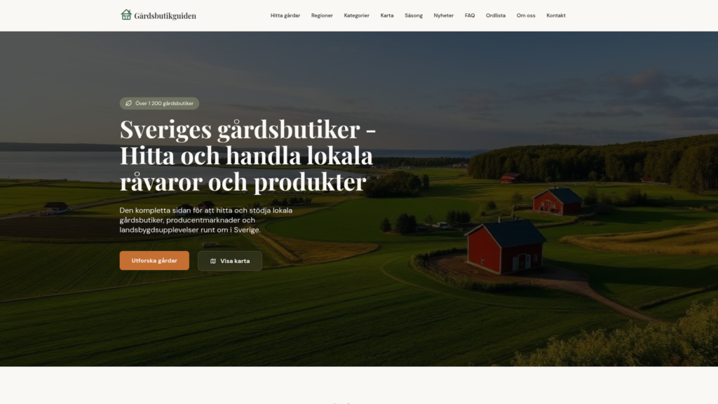
Gårdsbutikguiden
Sveriges kompletta guide till lokala gårdsbutiker, producentmarknader och landsbygdsupplevelser. Hive Creatives byggde plattformen som samlar över 1 200 gårdsbutiker – sökbara på region, kategori och säsong.
Webbplats · Brand
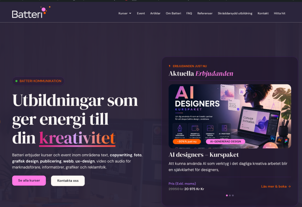
Batteri Kommunikation
Batteri Kommunikation utbildar Sveriges kommunikatörer och designers – med de bästa föreläsarna, små grupper och en nyfikenhet som ligger steget före tekniken. Hive Creatives byggde den digitala plattformen som matchar den energin: en sajt som inspirerar, fyller kurser och växer i takt med ett kursutbud i ständig rörelse.
Web development - Design
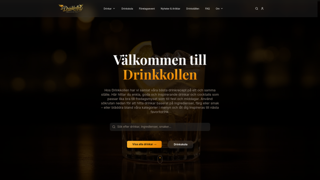
Drinkkollen
Drinkkollen is a user-centred, scalable cocktail platform that helps visitors find drinks based on the ingredients they already have at home - or by taste, mood and expression. Hive Creatives designed and built the entire digital experience.
Inspired by Walborg Coworking?
Let's build something similar for you.
Book a free consultation and we'll walk through how we can help you reach similar results – tailored to your goals and your industry.